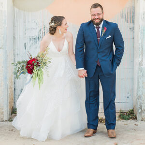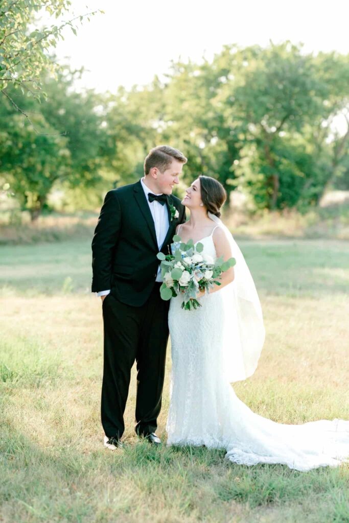
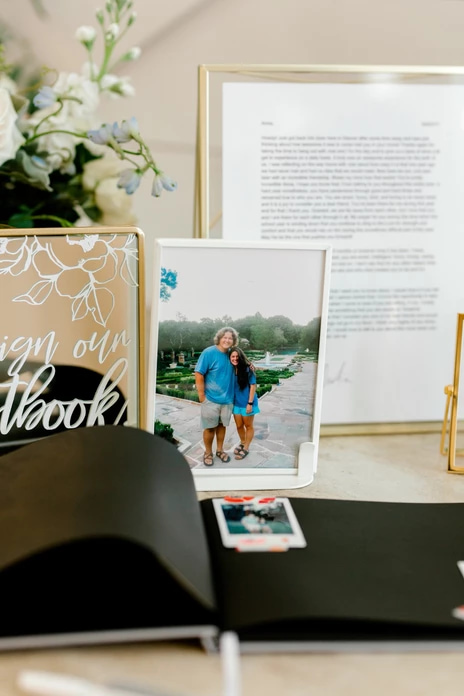
Every couple has a unique, special love story, and Anna + Billy’s is one of my very favorites. They met as camp counselors and slowly but surely fell for each other – and then, at the end of the camp session, Billy finally decided to make his move. He wrote Anna the sweetest letter to share his feelings, and from there, the rest was history.
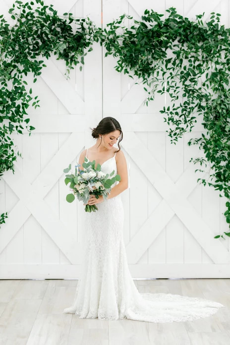
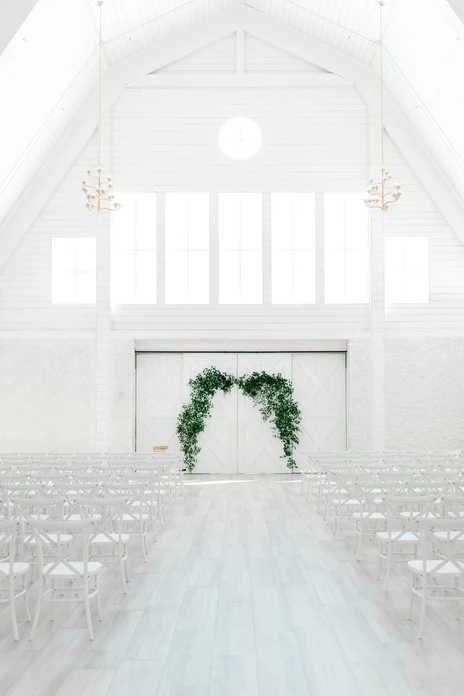
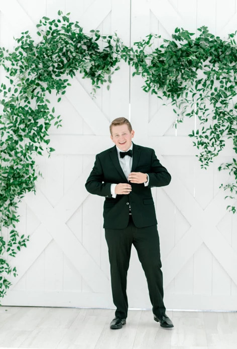
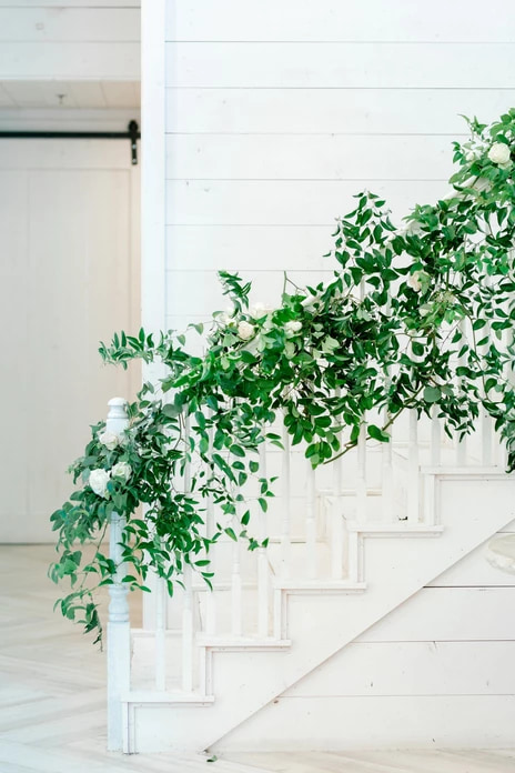
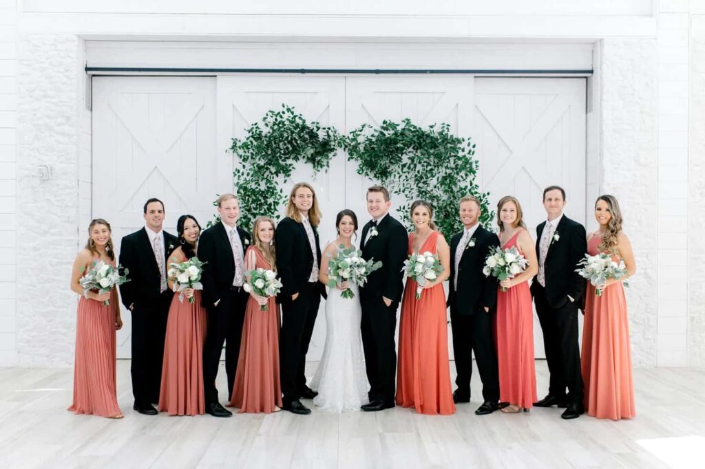
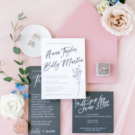
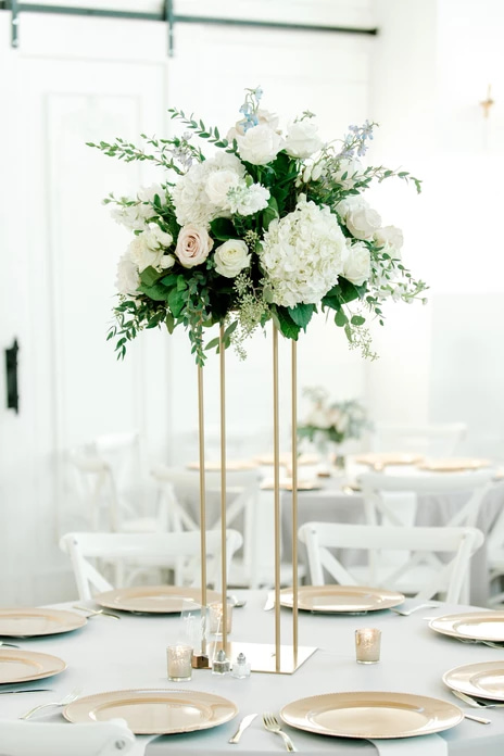
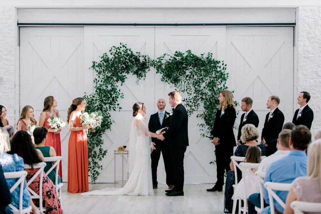
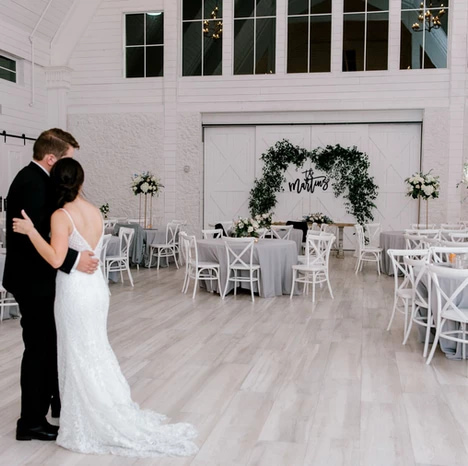
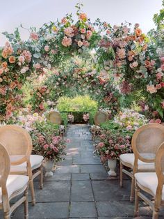
Anna + Billy’s wedding day was filled with so many of these same thoughtful, intentional details (including that framed love letter!), as well as a gorgeous, minimalist color palette and the most striking design elements – like the invitation suite, which Anna designed herself, and that AMAZING greenery arch that framed their “I dos” during the sweetest, loveliest ceremony based on their shared dedication and service to each other.
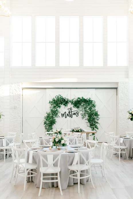
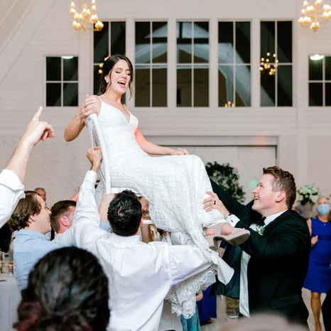
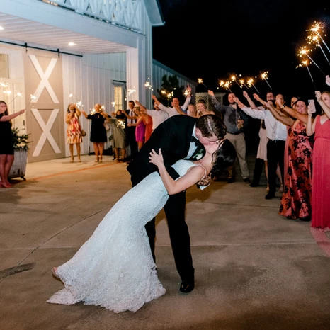
But it wasn’t all just lovely – it was a whole lot of fun, too! This wedding may have taken place during the time of coronavirus, but you would’ve never known from how big the party was. From the laugh-filled toasts to the packed dance floor to the radiant sparkler exit, the entire night was a dream – and I don’t think a single person stopped smiling the entire time.
Every guest (and every vendor, too!) felt so honored to get to play a part in this incredibly special marriage. It all felt like a fairytale, like the happy ending in a book – but for these two, it was just the beginning of what we all know will be a beautiful life together!
Like what you see? Check out our amazing vendor team below:
Photography: Sami Kathryn Photography
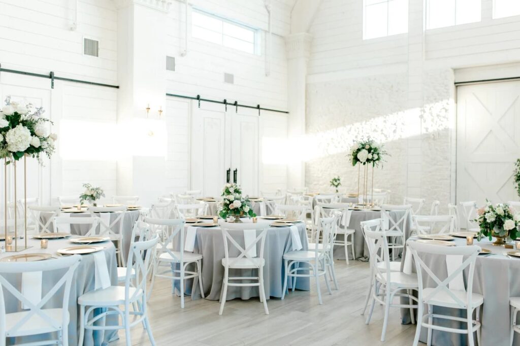
Venue: The Nest at Ruth Farms
MUAH: Brite Beauty
Florist: Pick a Daisy
Gown & Alterations: Wtoo by Watters, Gowns of Grace
Bridesmaids: Lulus
Groom & Groomsmen: Men’s Wearhouse
DJ: DJ Connection
Jewelry: Olive + Piper
Videographer: Peak Video
Transportation: Big Hat Limousine
Catering: TCP Catering
Bar: HD Liquid Catering
Baker: Sugar Bee Sweets
I resisted it for all of two weeks – as a guilty-pleasure Gossip Girl fan (and a total Blair), I knew I’d get sucked in immediately – but when we had our snow day this past weekend, I thought it was the perfect opportunity to pop a bottle of Prosecco and finally turn on Bridgerton.
Needless to say, I was hooked immediately – and not just because of the steamy Regency-era romance and the violin covers of Billie Eilish songs. I was totally drawn to the stunning floral arrangements, champagne towers, and warm candlelit ballrooms that made up the gorgeous party scenes of Daphne + the Duke of Hastings’s social world. It’s no wonder that Bridgerton has already become a huge trend in weddings!
Want to get a few ideas for incorporating this beautiful show into your big day? Check out some of our inspiration images below!
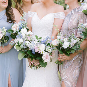
Unless you want to channel your inner Lady Featherington and go for bold canary yellows and lime greens, take a page from the Queen’s book and go for a more subdued palette. Simple pastels like blush pinks, sage greens, and that classic Bridgerton Blue pair beautifully with warm creams, ivories, and golds for a stunning and versatile look – and you’ll have plenty of options for flowers that fit into your color palette, too!
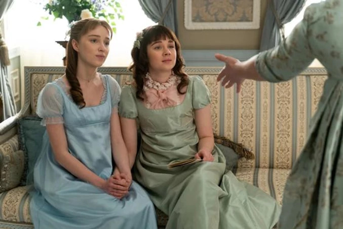
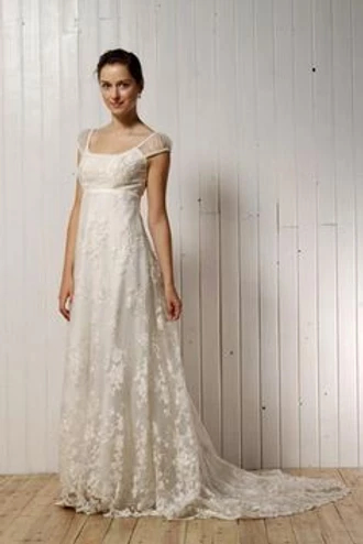
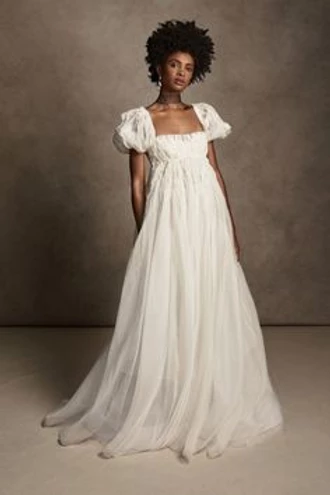
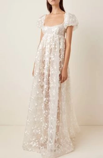
It goes without saying that empire-waist dresses and simple, lovely accessories are the order of the day. Try a gown with layers of delicate lace and a straighter, high-waisted fit (flattering AND easy to dance in – bonus!) for a look that Daphne would swoon over.
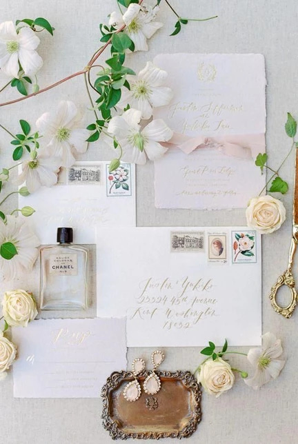
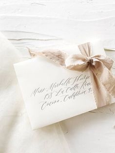
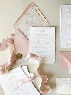
If you’re wanting an invitation suite worthy of being hand-delivered to the Duke of Hastings himself, opt for lightly deckled edges, beautiful ribbon accents, and, of course, custom calligraphy. The vintage look is timeless, luxe, and perfect for setting the tone of the wedding. And don’t forget about your day-of paperie, too, including place cards to keep your cute single friends seated far away from your, ahem, Lord Berbrookes. Wax seals are encouraged – dance cards, on the other hand, are optional.
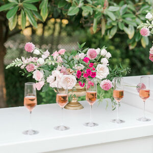
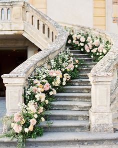
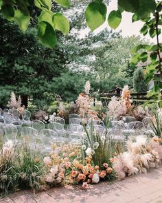
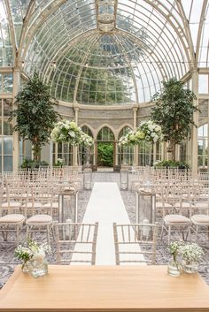
From the arrangements stunning bouquets delivered by suitors to the lavender creeping up the walls at Daphne’s family estate, flowers play a leading role in Bridgerton – and they should at your Bridgerton-inspired wedding, too! An al fresco fete would be ideal, but if you’re saying “I do” indoors, bring the outside in with statement arrangements and installations that make your guests feel like they’re dining and dancing in a garden.
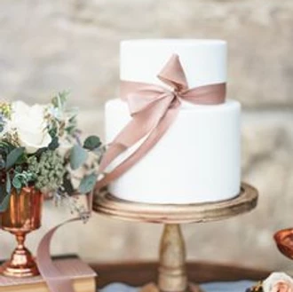
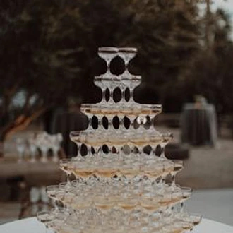
Just like at the balls and parties featured in the show, every decorative detail plays an important part in the overall design and feel of the event. From flatlays to cake design to mood lighting, you need to focus on creating a cohesive whole that really channels your inspiration into every aspect of the day. Look for delicate vintage pieces, warm tones, and luxe touches to complete the look. No detail is too small to be addressed – and don’t forget the champagne tower!

Feeling inspired to start solidifying your wedding vision? Drop us a note through our contact form! We’d love to help you create a wedding experience that even Lady Whistledown would approve of.

If you’re anything like us, you have a love/hate relationship with Pantone’s Color of the Year… at least in terms of actual real-life application. When 2021’s colors were announced – Illuminating Yellow and Ultimate Grey, in case you haven’t yet heard – we were a little stumped. We love grey – in fact, grey was one of Ginny’s wedding colors back in 2019 – and yellow is always a beautiful, vibrant favorite, but the two of them together seemed a little… 2013? Baby’s first nursery? Cheery guest bathroom? It definitely didn’t strike us as the next big trend in wedding colors, unlike 2020’s Classic Blue and even 2019’s Living Coral – both of which we saw LOTS of in our wedding designs.
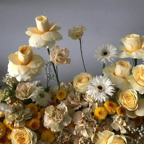
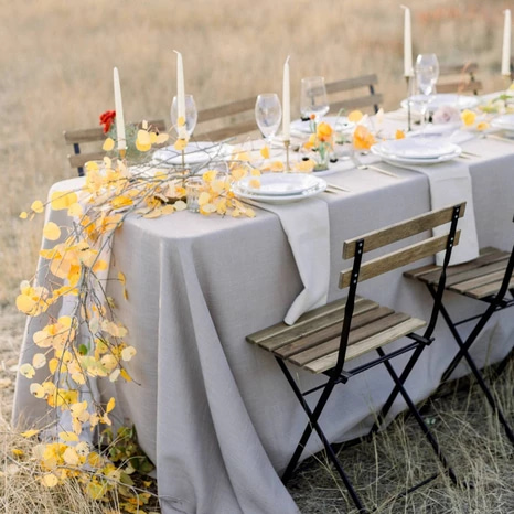
But then we wandered over to Pinterest and started putting ideas together – and we fell in love. If you make a few tweaks, like warming up the yellow and mixing a bit more black into your grey, what you end up with is a gorgeous mix of light and dark that works in any season. Check out some of our favorite examples from Pinterest:
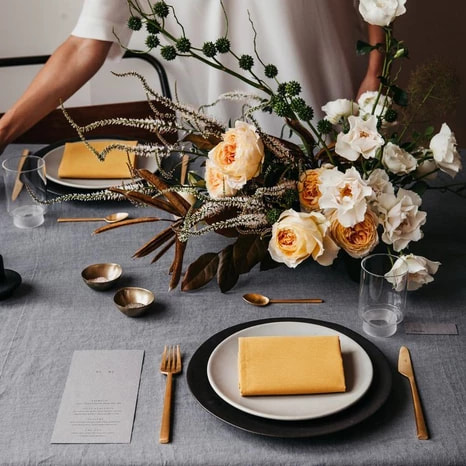
So, all things considered, maybe we judged too soo. When done correctly, this rich and unexpected color palette will make for a truly striking wedding design in any season and in any type of venue. Plus, after this crazy year we’ve all experienced, the meanings behind the two colors – yellow for hope, grey for strength – are enough to make anyone want to celebrate.
Image Credits: (1) Pantone, (2 and cover image) 100 Layer Cake, (3) Design by Nature Flowers, (4) Magnolia Rouge